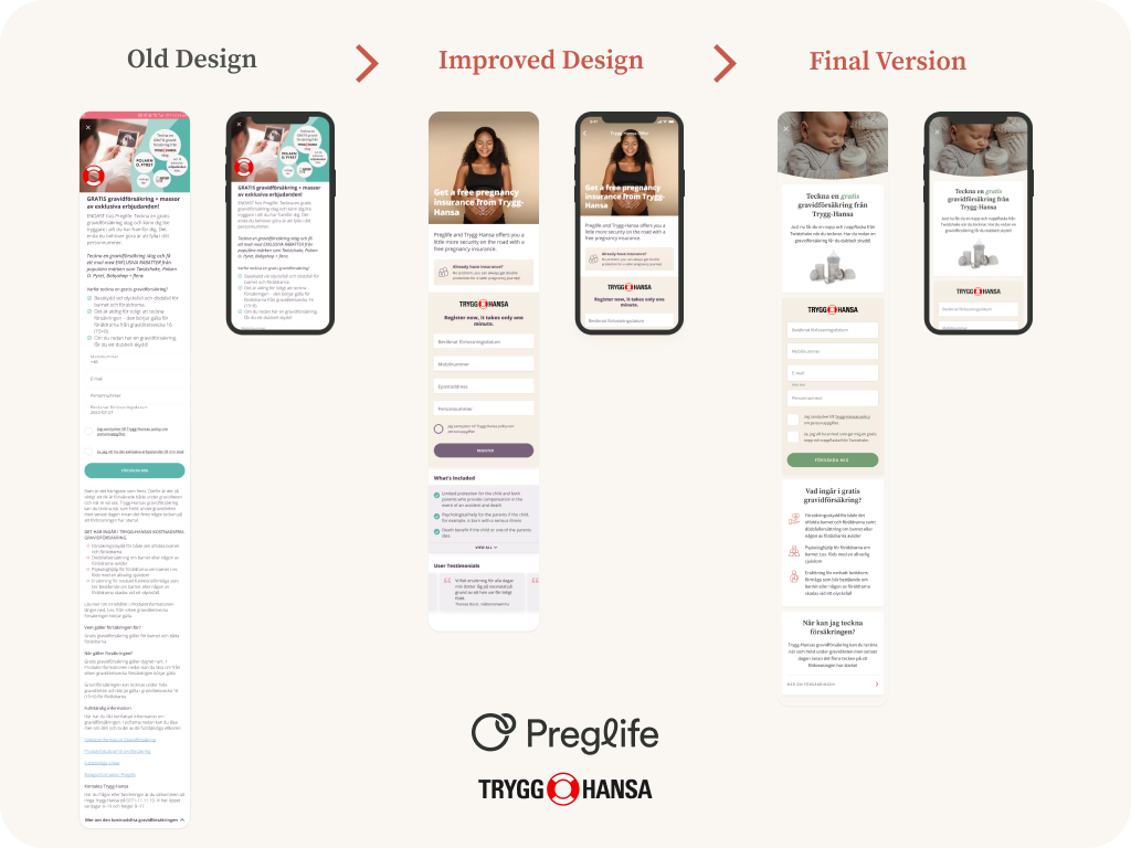
The assignment entailed redesigning an insurance offer provided by Trygg-Hansa within the Preglife app. The existing design was cluttered and failed to effectively guide users to the primary Call to Action (CTA)—the registration form. The overarching goal was to improve the user experience and increase conversion rates. This assignment was during my internship as a product designer at Preglife under the supervision of the lead designer, Etienne Namasu. The final design shown here is her improvement of my enhanced one after some time.
Problem & Assignment
- The original design was cluttered, featuring excessive text and overwhelming information.
- The registration form was not visually distinct, making it difficult for users to engage with the primary CTA (Call to Action).
- The uninspiring layout failed to leverage the trust associated with Trygg-Hansa's reputable brand.
Design Approach
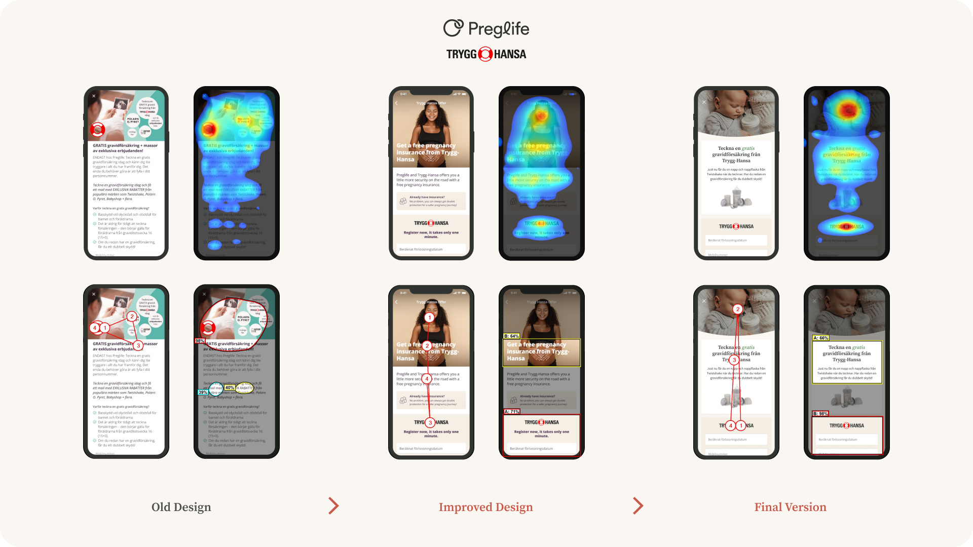
- I conducted a usability evaluation of the existing design to identify key areas for improvement.
- Collaborated closely with a lead designer and followed guidelines from Trygg-Hansa.
- Utilised heatmaps, gaze analysis, and visual sequence tools for data-driven design decisions.
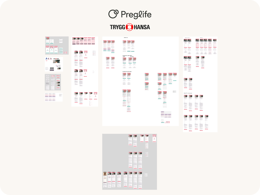
Process and Solution
- Developed multiple mockups incorporating feedback from Trygg-Hansa and the lead designer.
- The final design featured a visually appealing, less cluttered layout that effectively guided users' attention.
- Enhanced the prominence of the registration form and Trygg-Hansa's logo to encourage user engagement.
- Addressed several accessibility and usability issues with the registration form and communicated with the development team to ensure proper implementation.
Disclaimer
This project and its associated screens are the property of Preglife and Trygg-Hansa.
Any unauthorised use is strictly prohibited and subject to law enforcement and copyright laws.